My objective was to create a hero graphic to illustrate assets amplifying promotional efforts for the recently published “Cut the cost of complexity” from IBM’s Institute for Business Value (IBV). The directive from strategists was to reference the existing report but provide something simple yet compelling that could be animated and exist in a variety of assets.
A prominent theme throughout IBM’s automation products, which this set of deliverables is part of, is the idea of data, systems, and processes can move from chaos to control with the introduction of IBM’s AI products.
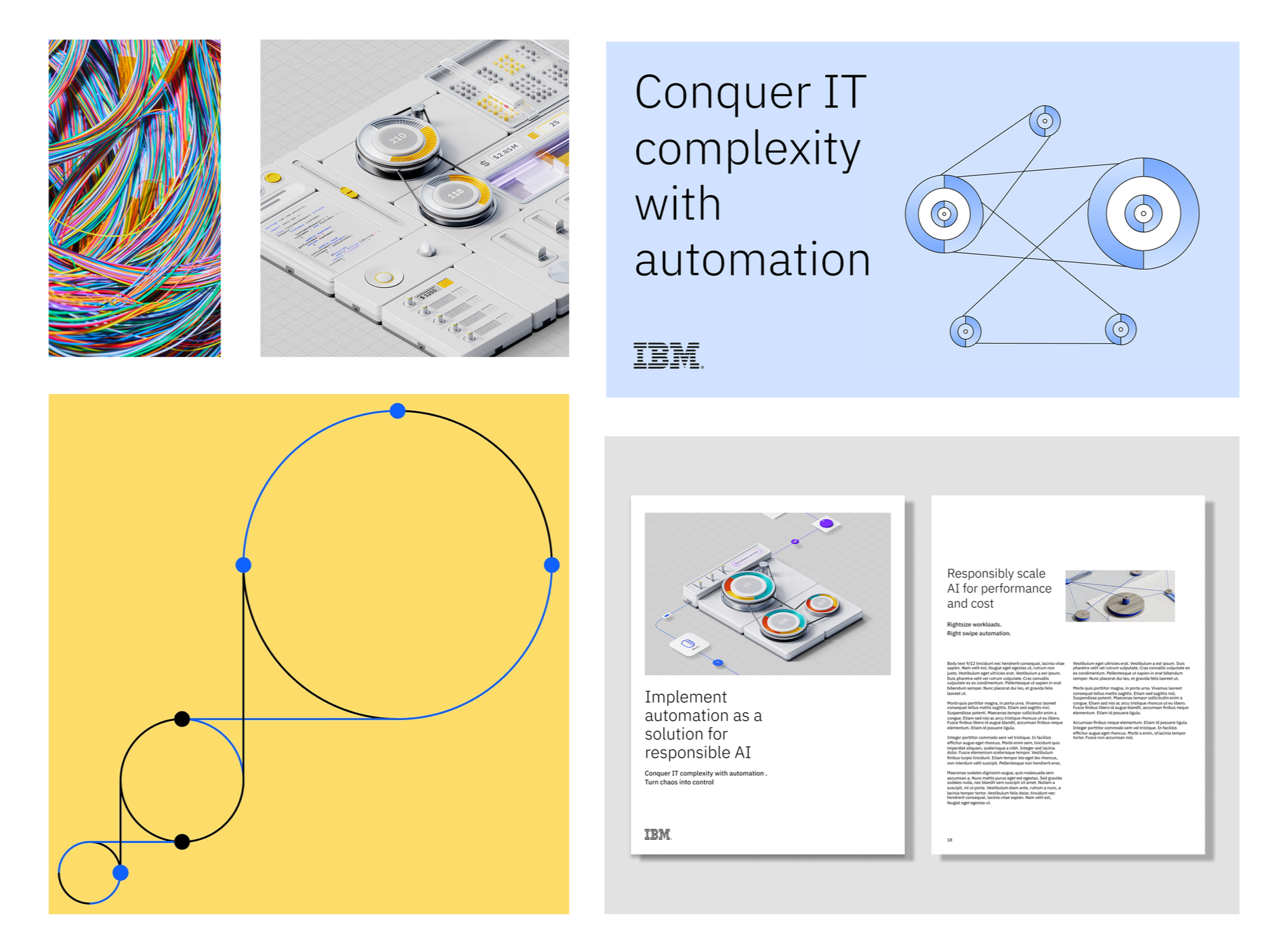
Additional assets included a web page lead space animation, an assessment tool, industry client leave-behinds, and a variety of paid media and social tiles.
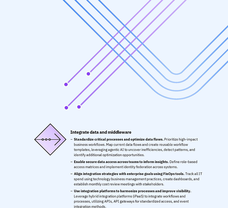
I pulled visual elements from the existing report with its prominent use of purple and cyan. There was an unusual lack of IBM’s signature blue color.
I paid special attention to the repeated occurrences of curves and crossing lines, and the use of gradients to express movement.
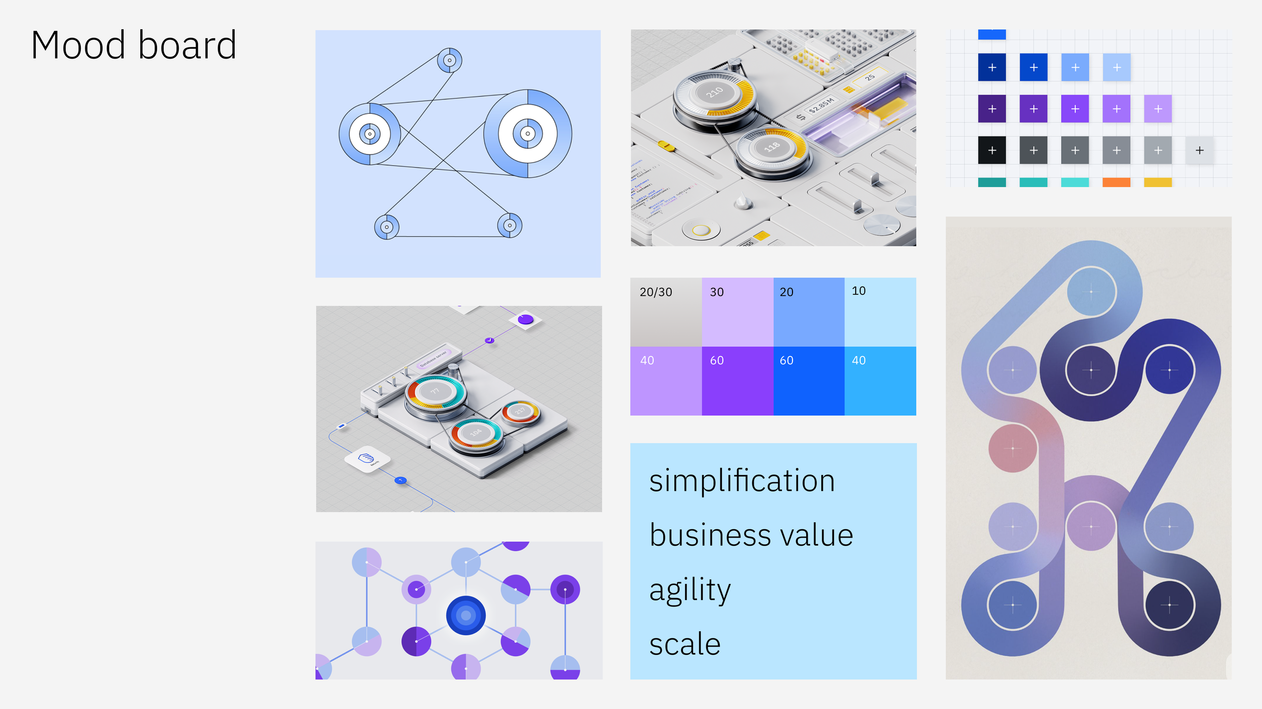
The brief from the original asset request presented a number of key words to influence visuals.
Simultaneously concepting for animation and static
The team started thinking about the messaging that complex processes need to be reigned in for financial and systemic reasons. How do you unravel a messy tape so that it ends up neatly rounding the turns? All of my early sketches were too complex but what was really needed was a single line that could Well, you don’t unravel it…you just scrunch it up a bit.
I explored work that had been created or was in progress in other automation product marketing efforts. I gravitated toward the spindle graphic in the social tile on the upper right, and while I was referencing the automation toolkit, I noticed there were several incidences of the spindle/tape concept in those as well.
Details
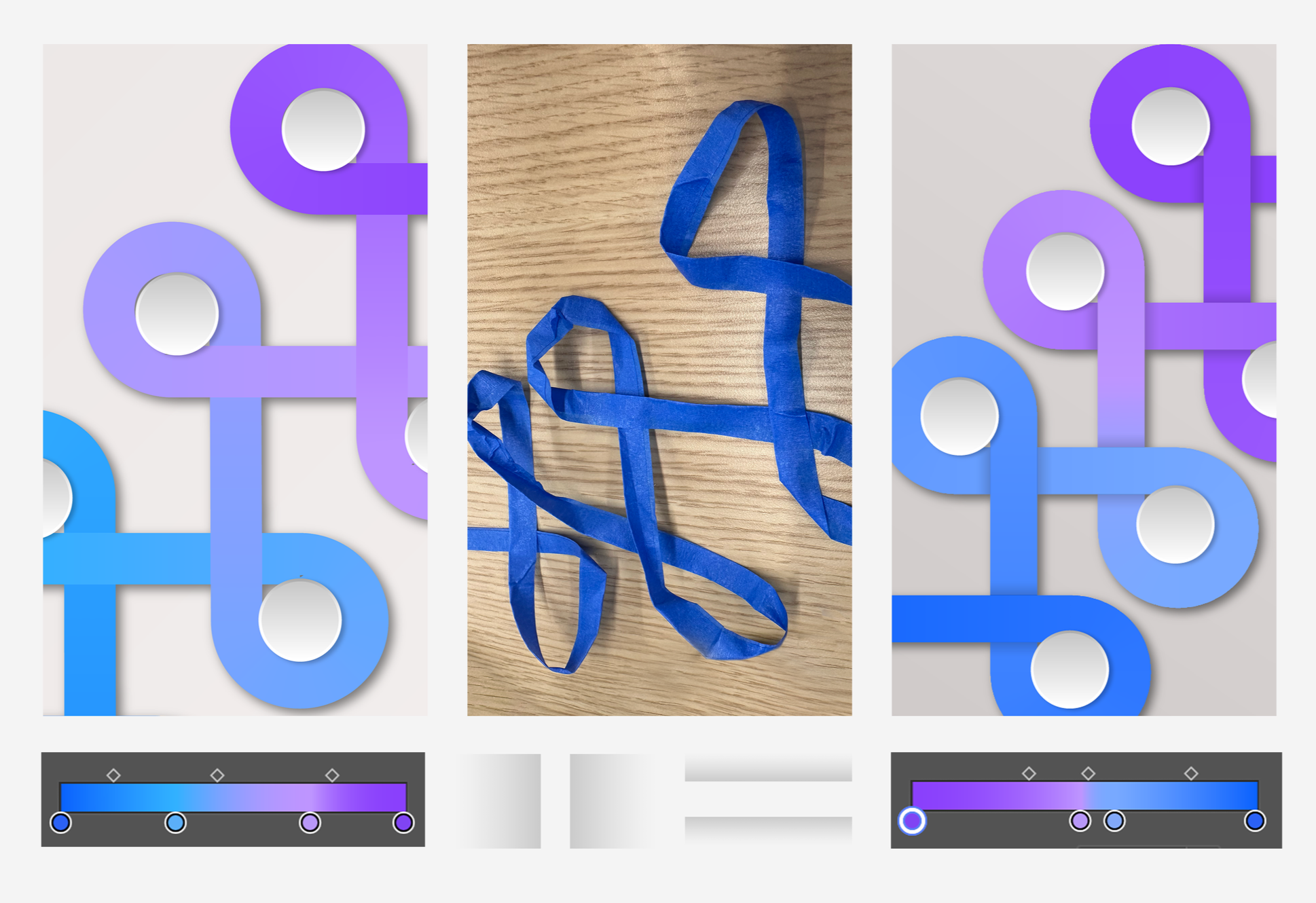
The colors composing the gradient required adjusting. I initially made the basic gradient with an equal distribution of blue/cyan/purple. Automatic application of the colors left us with cornflower blue on a large segment of it, so I adjusted the numbers and stops on the gradient to get it to transition properly, keeping with the IDL color library.
As illustration styles at IBM evolve, subtle shadows are being used more deliberately, to evoke 3D forms without over complicating them.
But just applying a drop shadow to the spindles and tape doesn’t quite work, because it’s a Adobe Illustrator vector drawing; Illustrator doesn’t “know” that it’s supposed to be a ribbon running over and under itself. To better understand how the shadows could make more realistic impact, I made a own ribbon out of some masking tape in the office and laid it out in the configuration of our illustration. Below that photo are the shadows I came up with, manually drawing them with a gradient and setting it to multiply and it gives a more realistic effect.


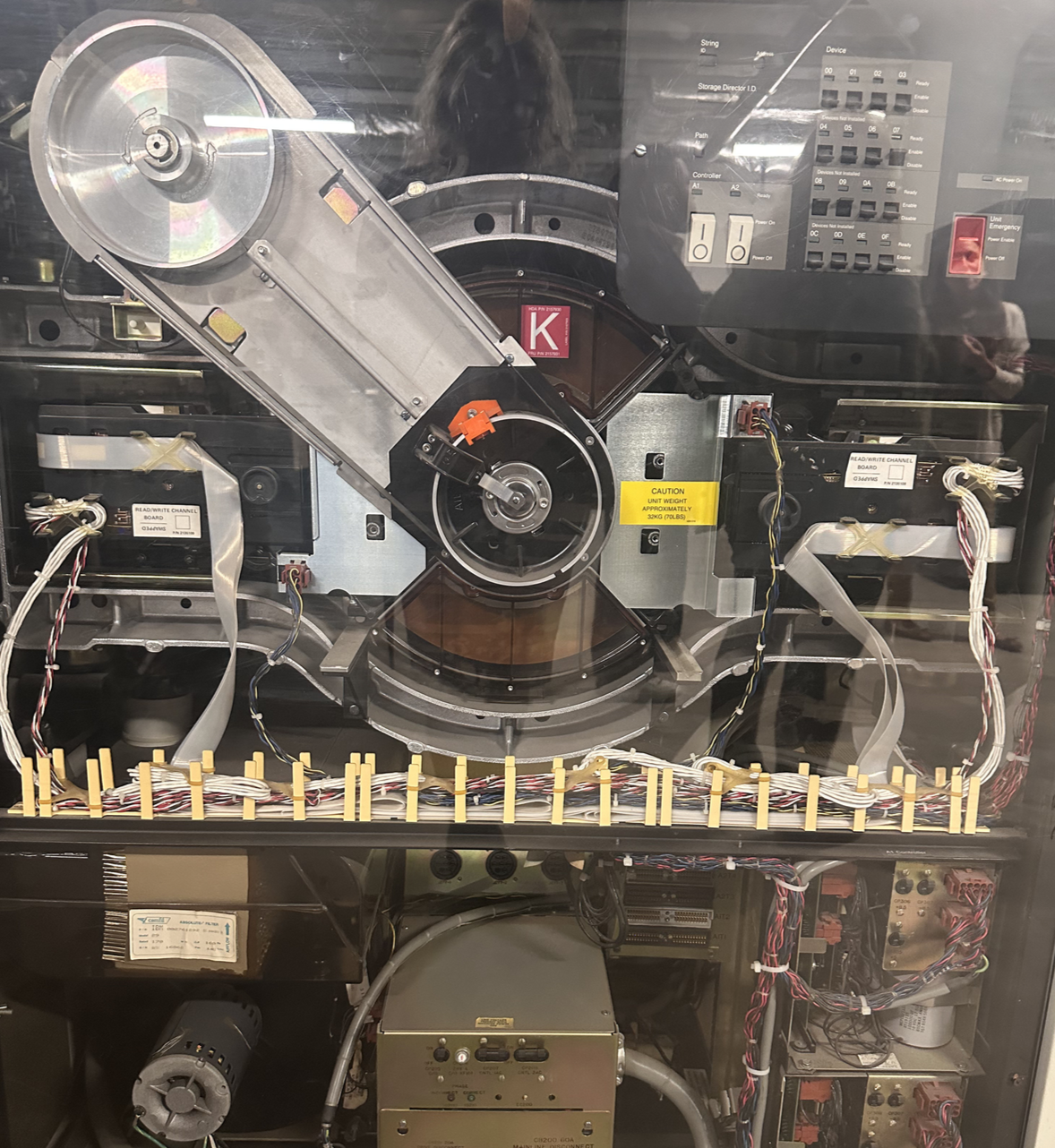
During the development of this project, my team and I had the opportunity to visit the IBM Archives in Poughkeepsie; I found this machine makes an interesting real-world example of the form I had seen in so many marketing pieces.
IBM COST OF COMPLEXITY
Illustration deep dive