Before I was brought aboard, usability tests had focused on gauging the Showroom experience in terms of customer interest rather than ease of use. Upon further testing, I found new users were unaware of the Showroom until it was pointed out to them. Use of features within the Showroom was confusing without guidance. For upgrades to the site, I proposed an onboarding process for the Showroom, in the form of a step-by-step tour.
Questions included:
How did you start the shopping process for bridal party dresses?
Describe any rules governing your purchasing decisions.
Tell me about your favorite/least favorite shopping experience. Who was there? Where did you go?
How did you communicate with the party members?
Tell me about your experience shopping online for clothing in general.
Top results:
10/10 described color choice as the most important factor in choosing a dress.
7/10 preferred that bridal dress choices be made by the Bride and/or Maid of Honor, avoiding a group shopping day.
10/10 said they would browse for clothing in an app but make purchases on a desktop or laptop.
7/10 interviewees preferred a single line of communication with their party.
6/7 could not locate the Showroom without guidance.
7/7 did not understand “My Dress” area in the Showroom and assumed it was there for them to upload a bridal gown.
7/7 were frustrated that color swatches didn’t act as filter.
4/7 did not see commenting option or section.
Two priorities emerged:
Reduce users’ cognitive load for locating and understanding options within the Showroom.
Design a clear, frictionless introduction to the Showroom itself.
This chart to advises the Developer team of the options available to users from the improved Showroom dropdown.


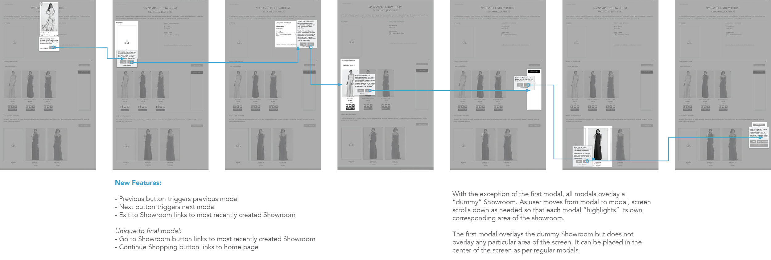
Mid-fidelity wireframes
My initial concept was designed to fit the desktop space. These wireframes illustrate a tour which overlays a dummy showroom and explains each section as the user scrolls down.
I started to sketch out a similar experience for mobile, but our limited resources for the upcoming two-week sprint wouldn’t allow for the creation of two different onboarding experiences.
With this constraint in mind, I re-designed the showroom tour as a series of modals overlaying an empty showroom. They are specified to fully display on the smallest available screen size.


Upon approval, hi-fi wireframes would have been produced applying on-brand visuals.
In 2018, I worked with Occasion Brands to conduct usability studies for Kleinfeld Bridal’s new bridal party website.
The objective was to create a unique Virtual Showroom feature to help bridal parties share an online shopping and purchasing experience when members of the party aren’t available to shop in person.
Research
It’s not a criticism to say that everyone on the team, including myself, came in with preconceived notions about bridal shopping.
I interviewed 10 women who had been in weddings in the last two years, either as a bride or bridesmaid. Traditional affinity mapping helped me recognize patterns of behavior related to their experiences.
personas
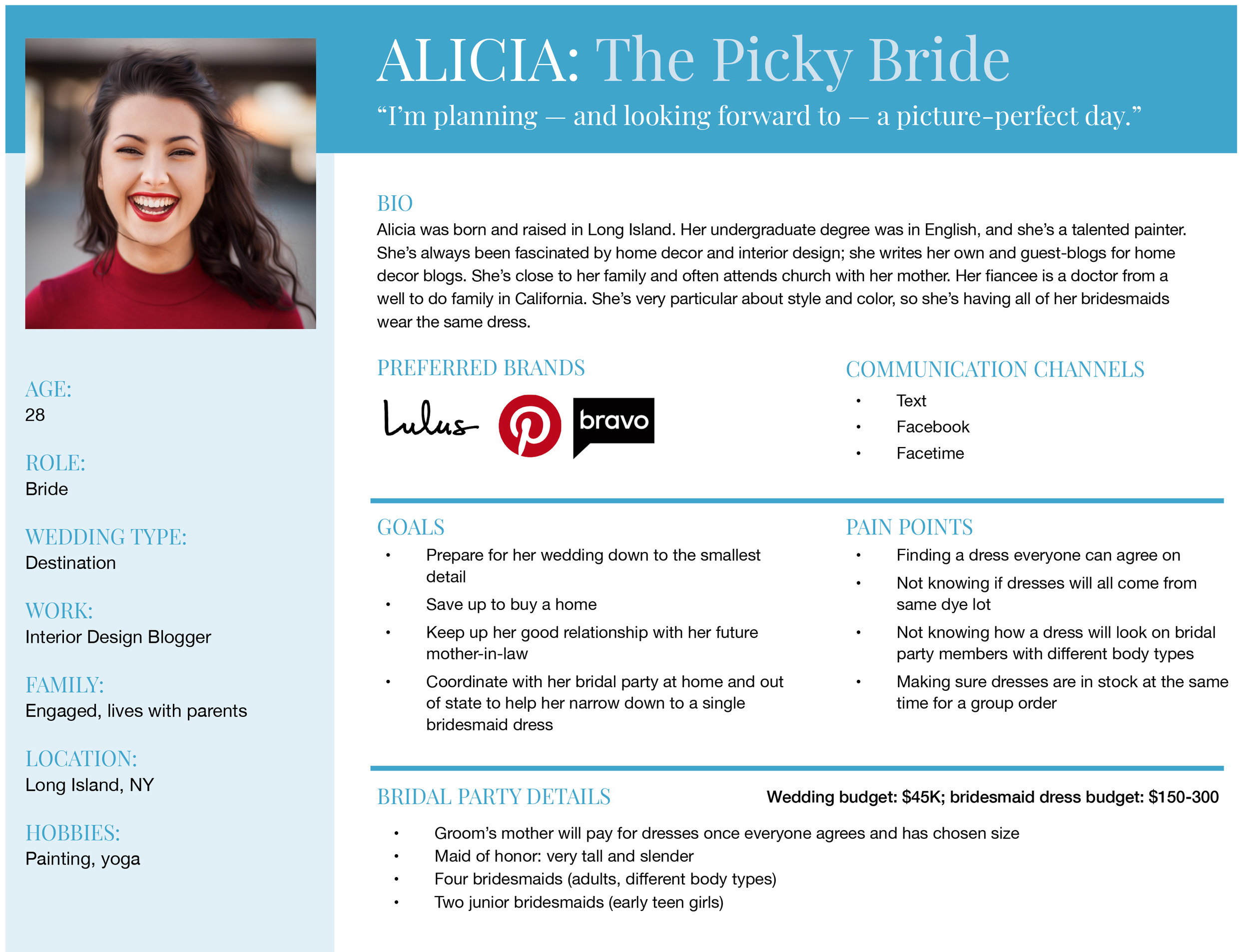
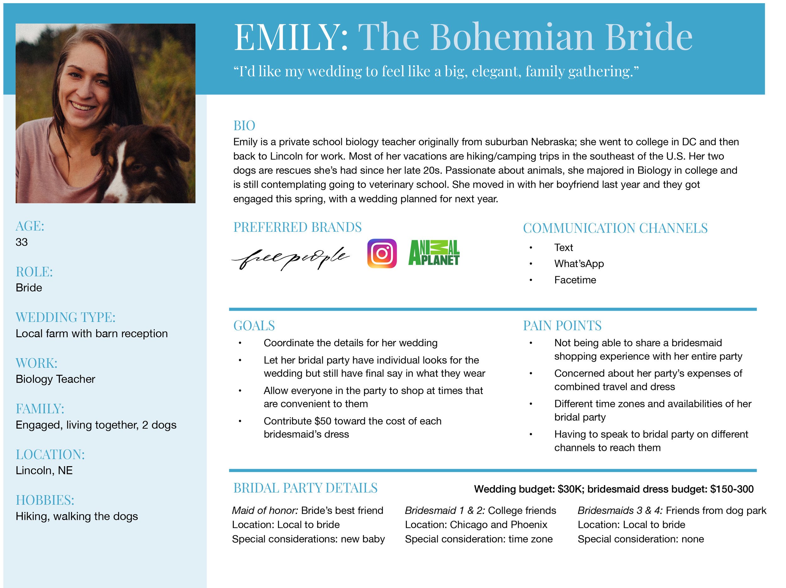
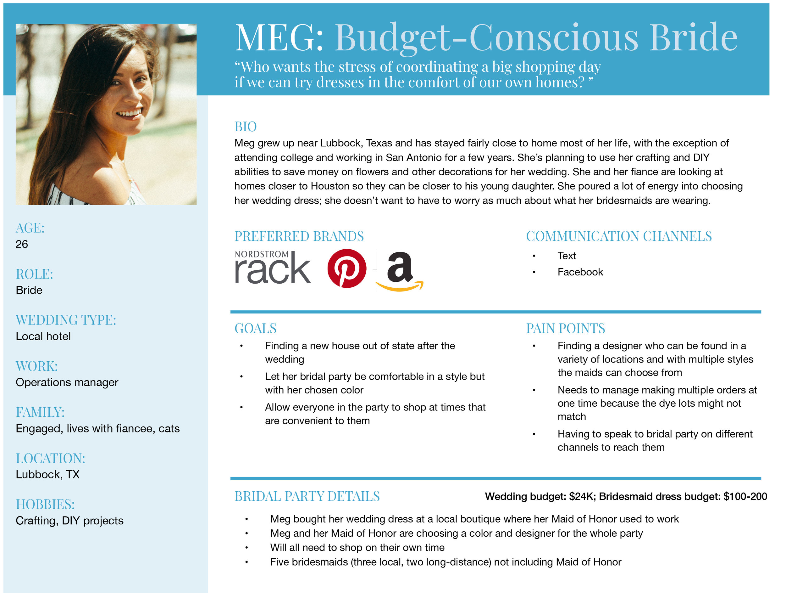
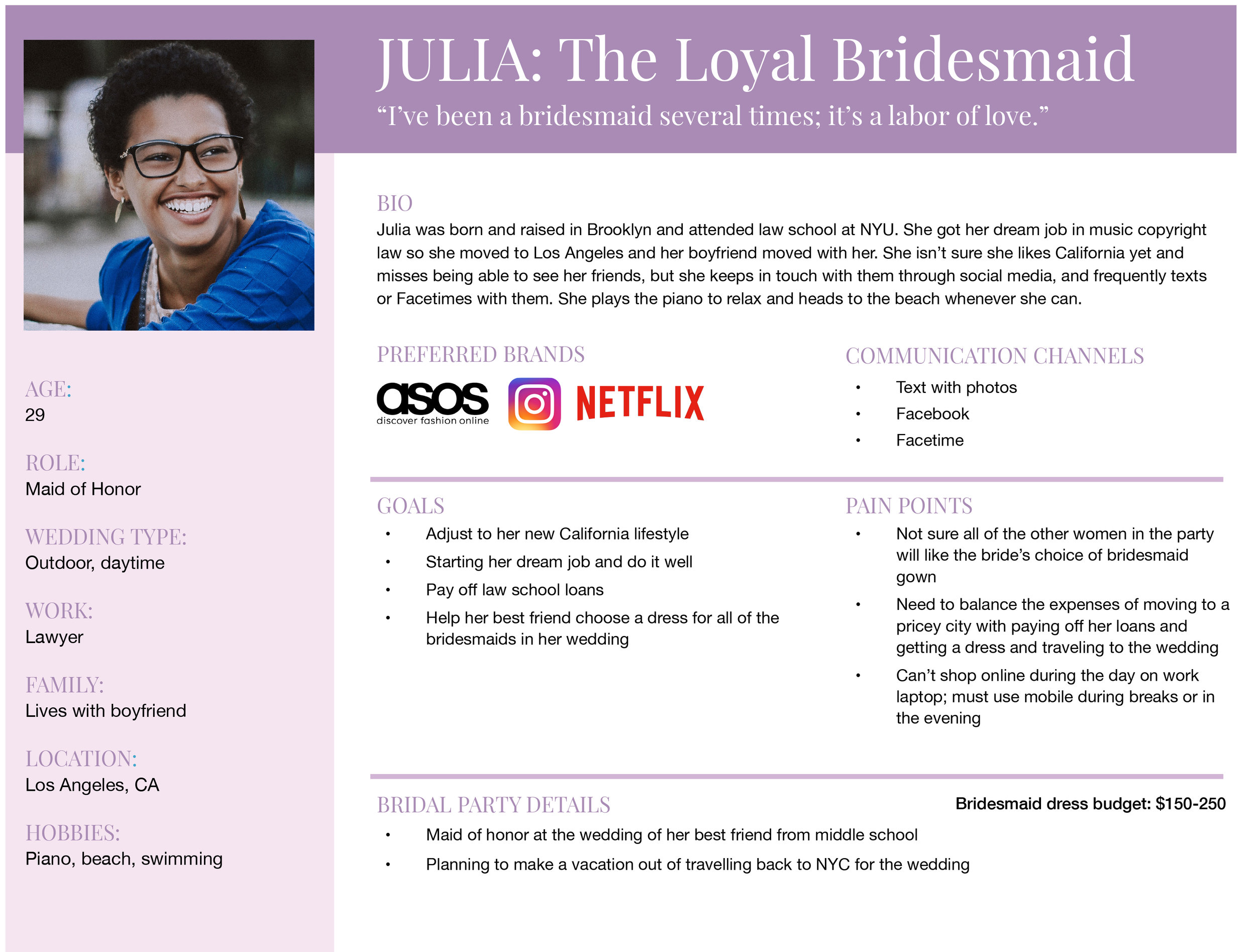
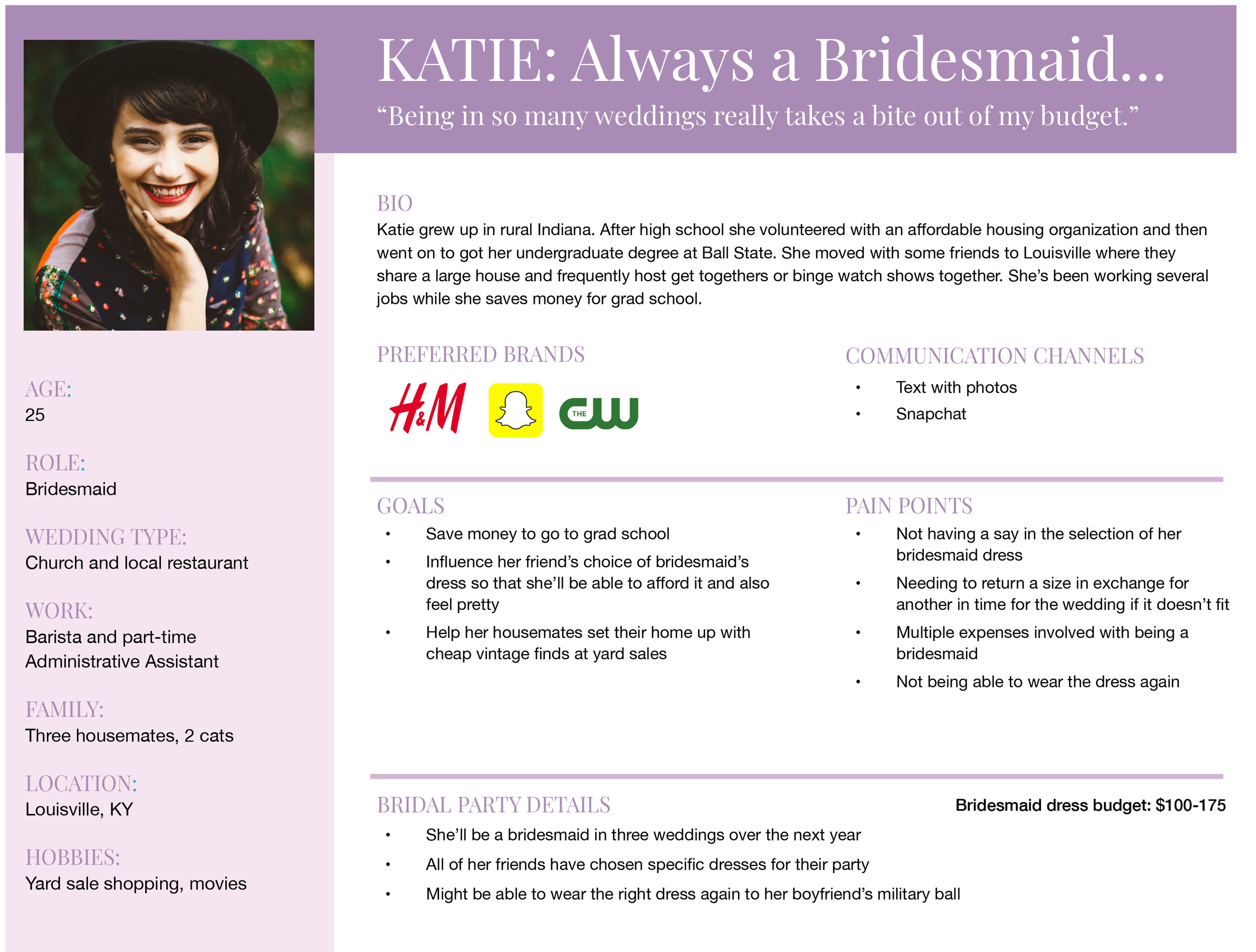
Combining my findings with data previously collected by the team, I created personas for approval by stakeholders (including the Director of Product Development and Brand Managers) to ensure we all understood our customers. Stakeholders provided budget ranges to assign to the appropriate persona.
Recommendation 2:
Onboarding tour
An examination of competitors and how they handle new users was enlightening.
At dessy.com, prior to accessing the showroom, the site automatically runs the user through multiple modals with instructions.
At azazie.com, the showroom feature is explained in the FAQ on a single page.
next steps

Existing product usability testing
In usability testing where scenarios and tasks were assigned without background or guidance, users weren’t able to navigate the showroom smoothly or confidently. They liked the idea of the virtual Showroom, but were too frustrated to make it work.
Recommendation 1:
Dropdown menu
The existing drop-down menu to create or access a Showroom offers little to clarify what exactly the feature does.
The “Personal Showroom” acts as a Favorites page; this was also not clear to users when viewing the menu.
Right, a storyboard I provided to the Developer team describing proposed changes, including introductory information, changing “Personal Showroom” to “Favorites,” and the option to retake the tour as needed.

kleinfeld bridal party virtual showroom
UX/UI research and design